REEBOK IVERSONICS, basketball shoe design process: part 5 - new logo
I know you were anxiously waiting to see the final Iversonics shoe design but, before that, it’s time to find a proper logo for this project!
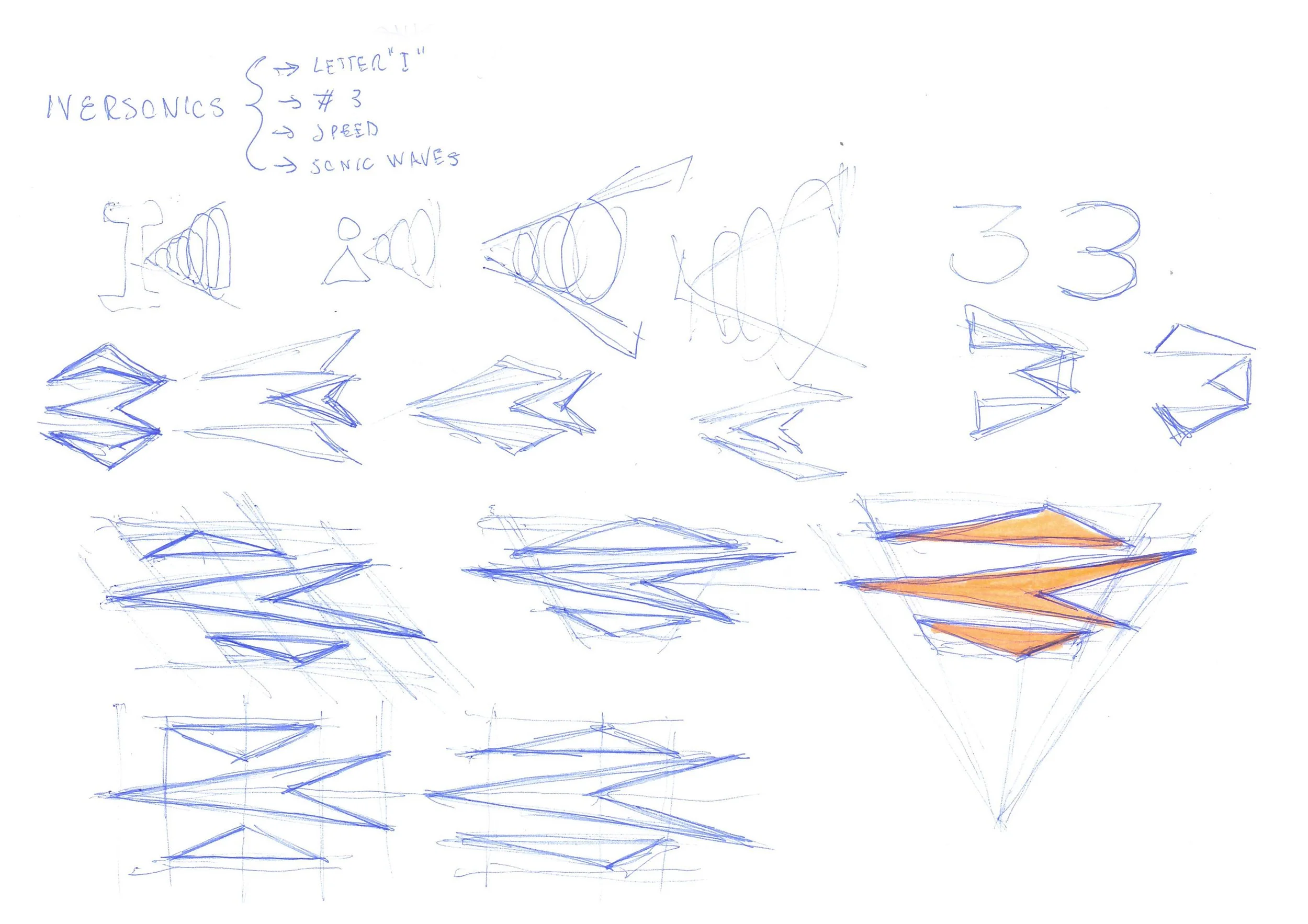
Directly from previous studies and project brief, the inspirations for this phase have been:
letter “I”;
number 3;
speed;
sonic waves.
I’ve started the sketching phase as loose as possible, using a blue ink pen on regular A4 copy paper.
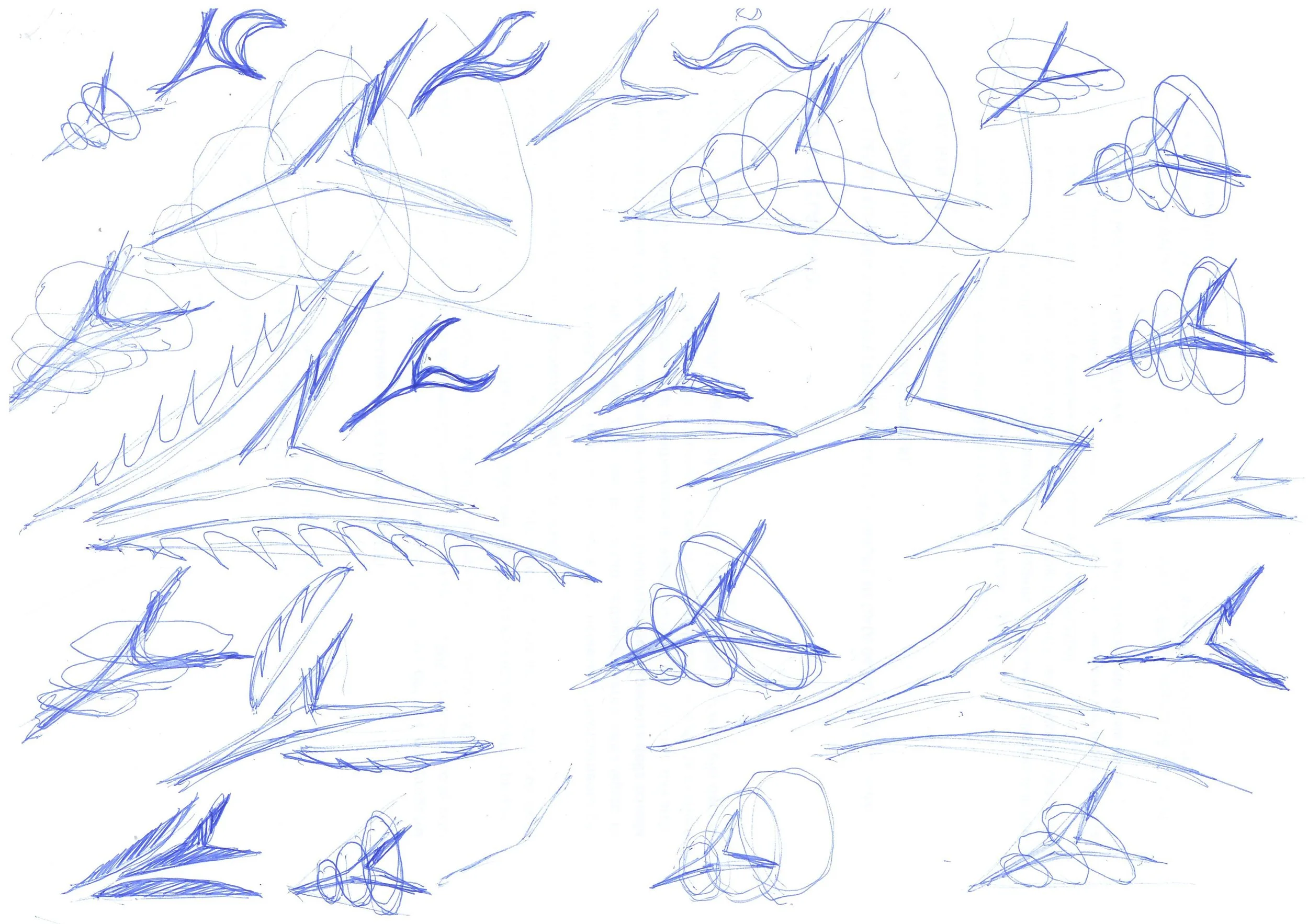
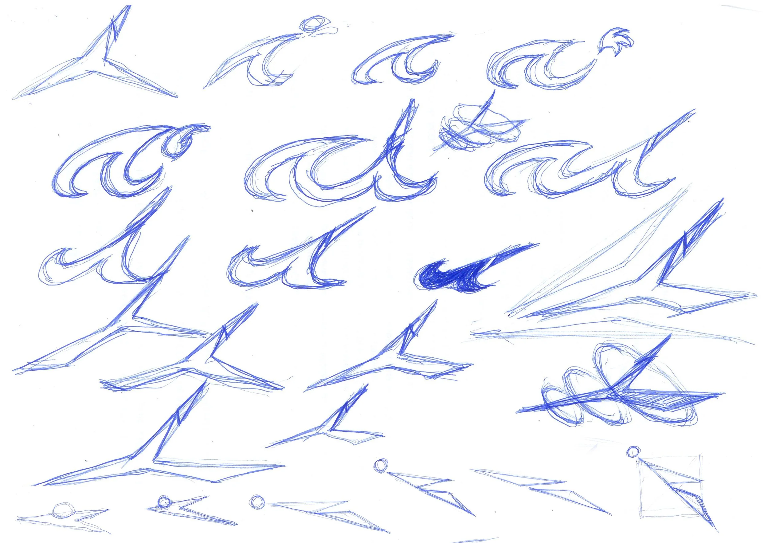
Logo design, sketching phase
As you can see from first iterations, the “I” letter was the core of the design and I’ve also tried many different solution to find something to mimic the sonic waves effect. For the “I” letter, I’ve started to work on a three arms star, as much dynamic as possible. Eventually, the (semi) vertical arm of the star was split in two parts to represent the dot over the minuscule “i”.
In the last series of sketches the design started with the number 3, splitting it in three semi horizontal elements, where the central one quickly became a left directed arrow, and top and bottom one represented the sonic waves.
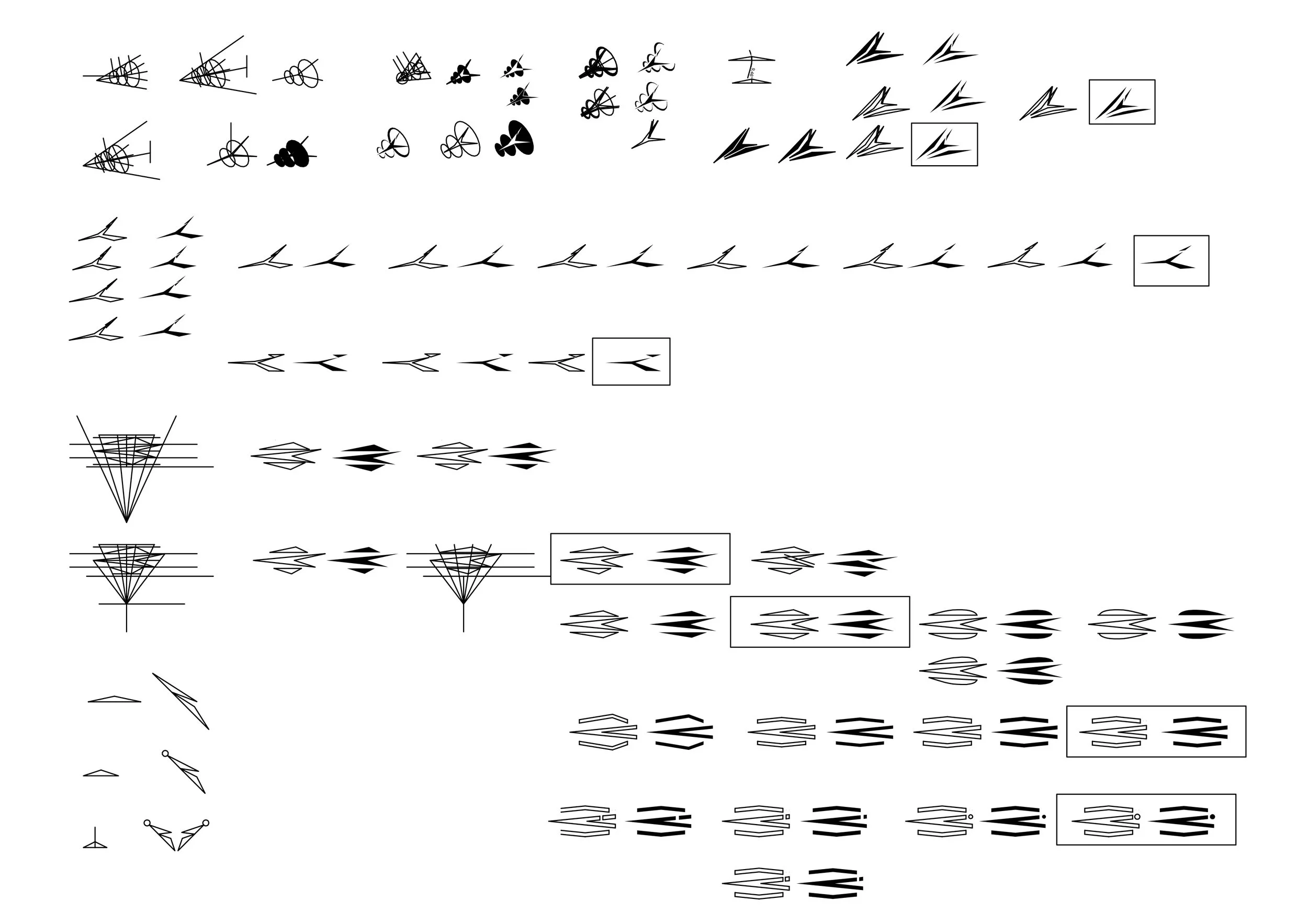
Logo design, development with CAD software
To better evaluate the most promising solutions and to evolve them in a more precise way, logo have been digitalized into a CAD software.
As you can see, the development of each solution took several iterations. Changes were often minimal and, to properly refine proportions, a precise graphic construction was sometimes necessary.
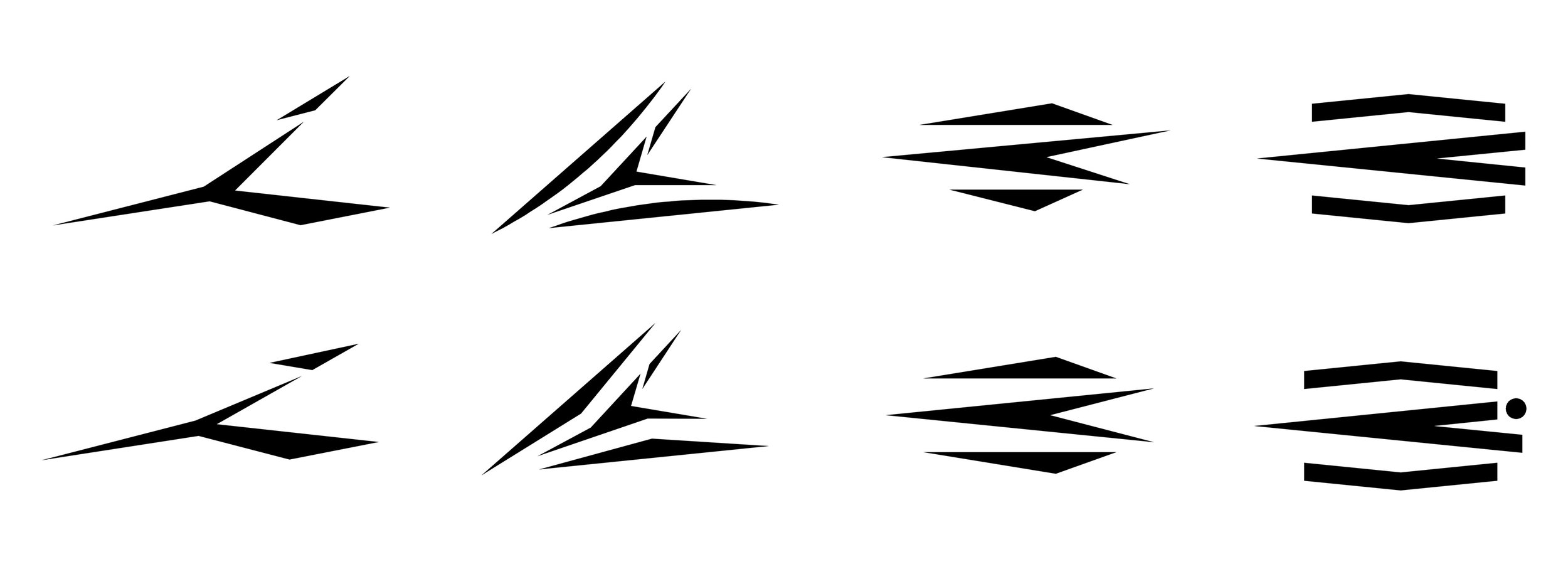
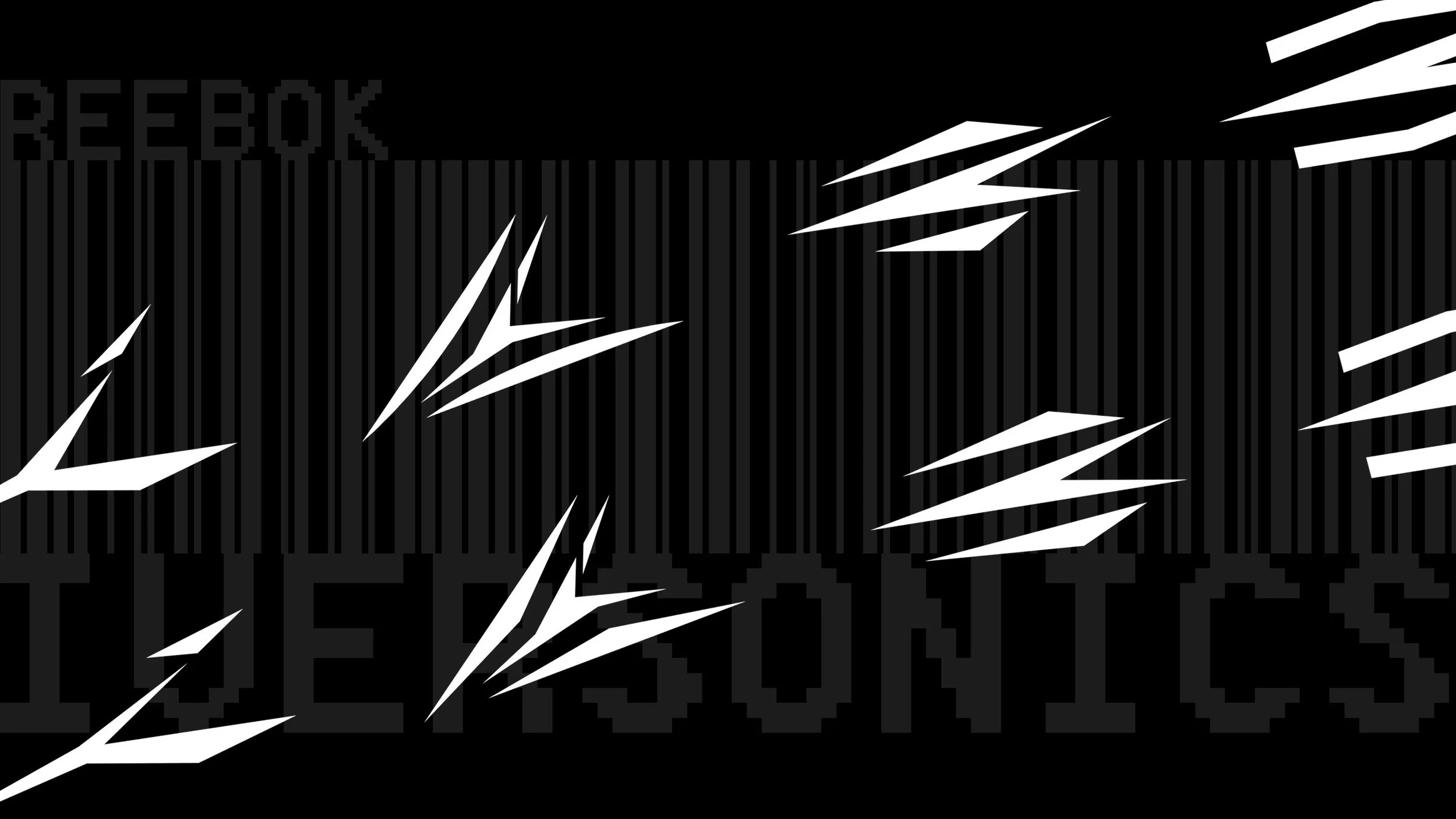
Logo design, selected solutions
Among all the different variants, the 8 above are my final choices.
My favourite so far are the one at the bottom left corner or the the second one from the right side, at the top line, but I will take some more time to better evaluate them all.
Which one do you fits this theme at best?
Do you think I’d need to refine logos a bit more?
Let me know you thoughts and feel free to give me your honest feedback, plus, if you want to know how the Iversonics project will develop, stay tuned for part 6!