REEBOK IVERSONICS, basketball shoe design process: part 7 - final design + oncourt views!!!
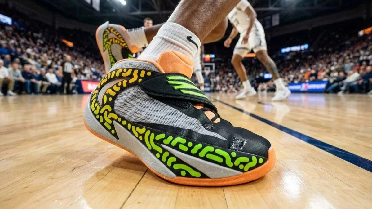
After adding the new logo and a few design updates, here we go with fresh on court views and colourways of Reebok Iversonics concept shoe.
Part 6 ended with the presentation of a brand less render and a few AI generated on and off court views of the shoe.
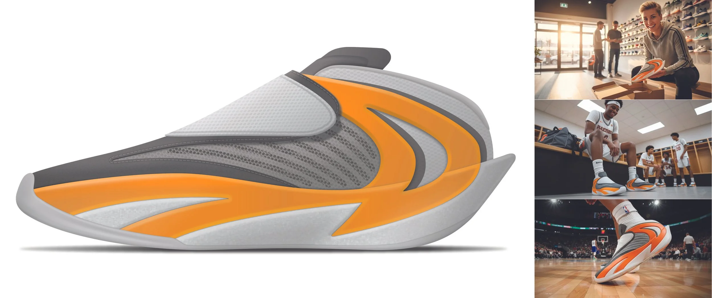
Reebok Iversonics - part 6 recap
Also looking back at part 5 of the design process, it was time to select the final Iversonics logo to be applied on the shoe.
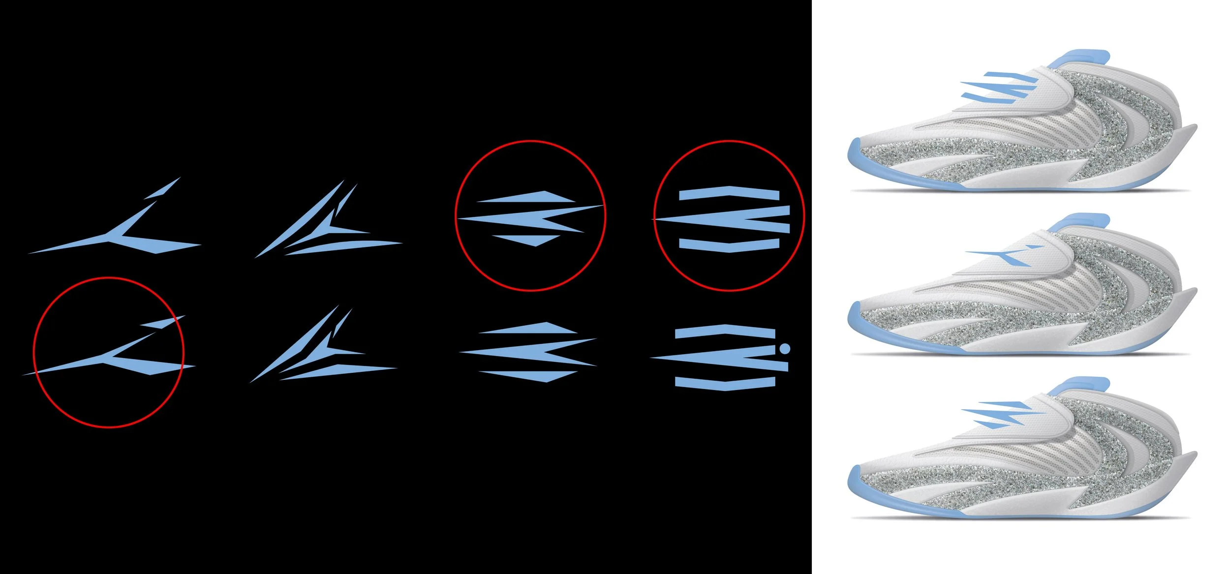
Logo selection and testing over the shoe
Best three of final eight selected logos were tested on the shoe render to see which one looks the best.
Top shoe solution was chosen, because it seemed to me the strongest one and the most recognisable from distance, while the center one kinda gets lost in the picture and the bottom one is weaker than the top one.
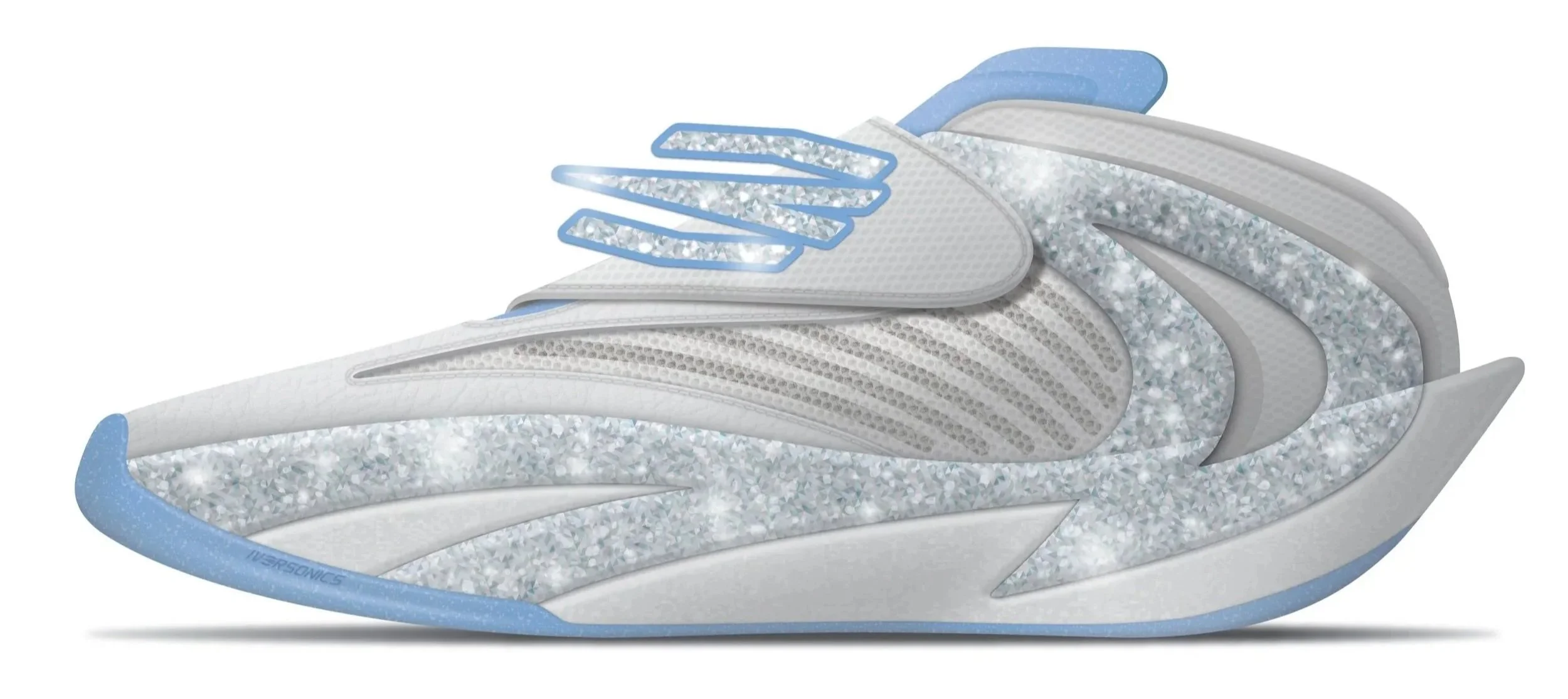
Reebok Iversonics - final render
Let’s have some fun with a few cool colourways
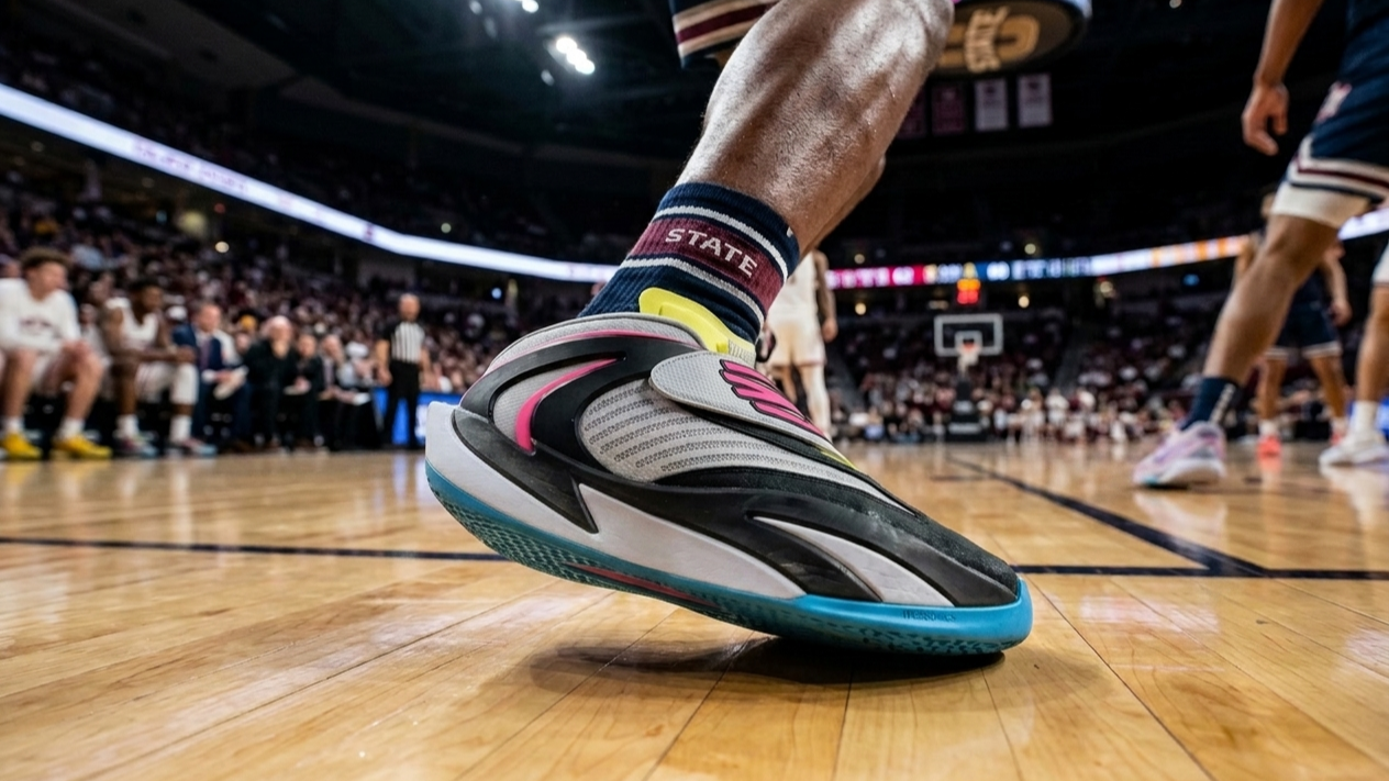
Reebok Iversonics - White, Black, Neon
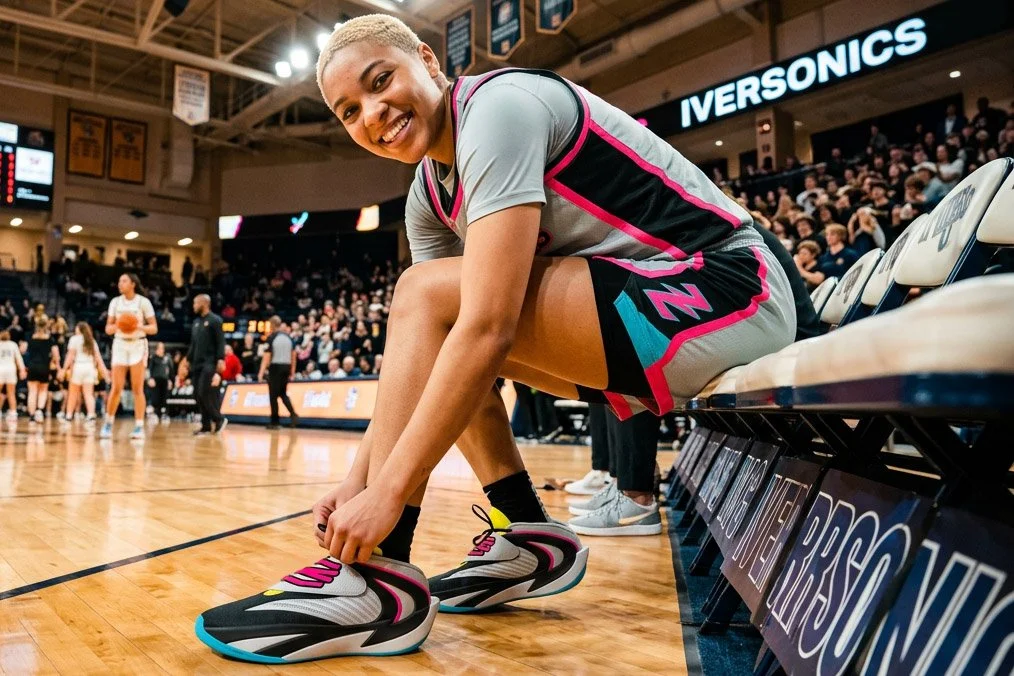
Reebok Iversonics - White, Black, Neon
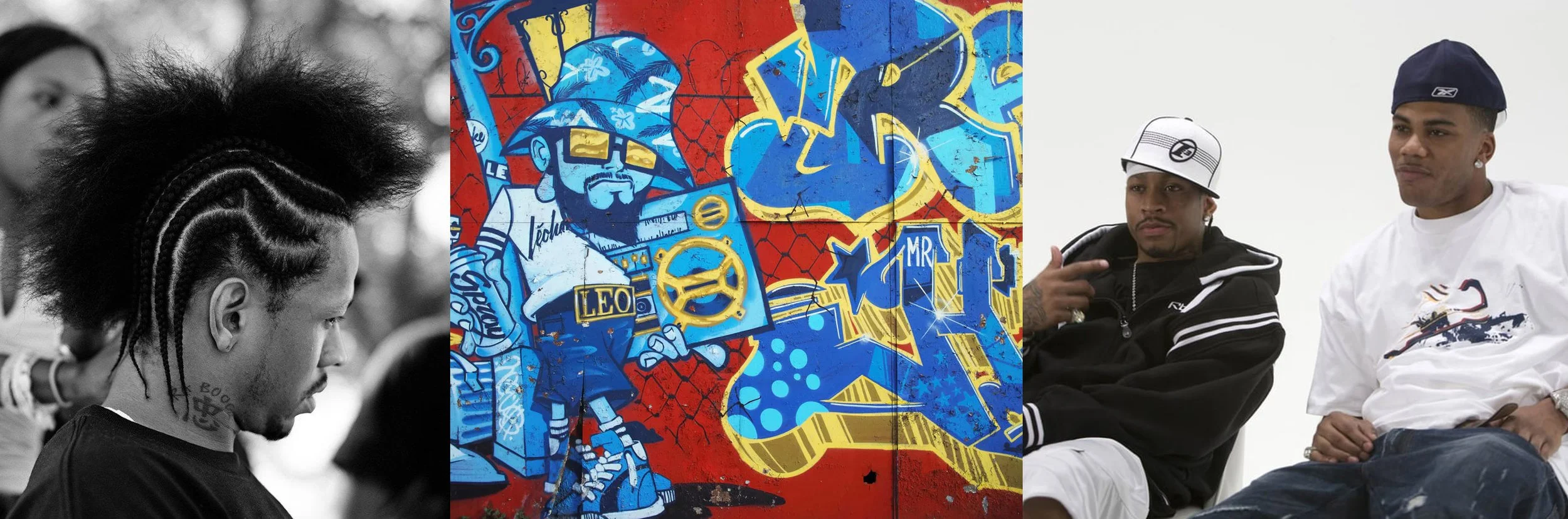
Allen Iverson has brought street culture into the NBA and also showed it to the world
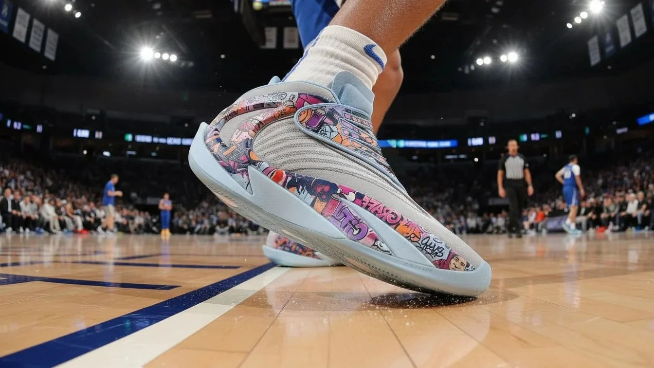
Reebok Iversonics - Clear blue and grey
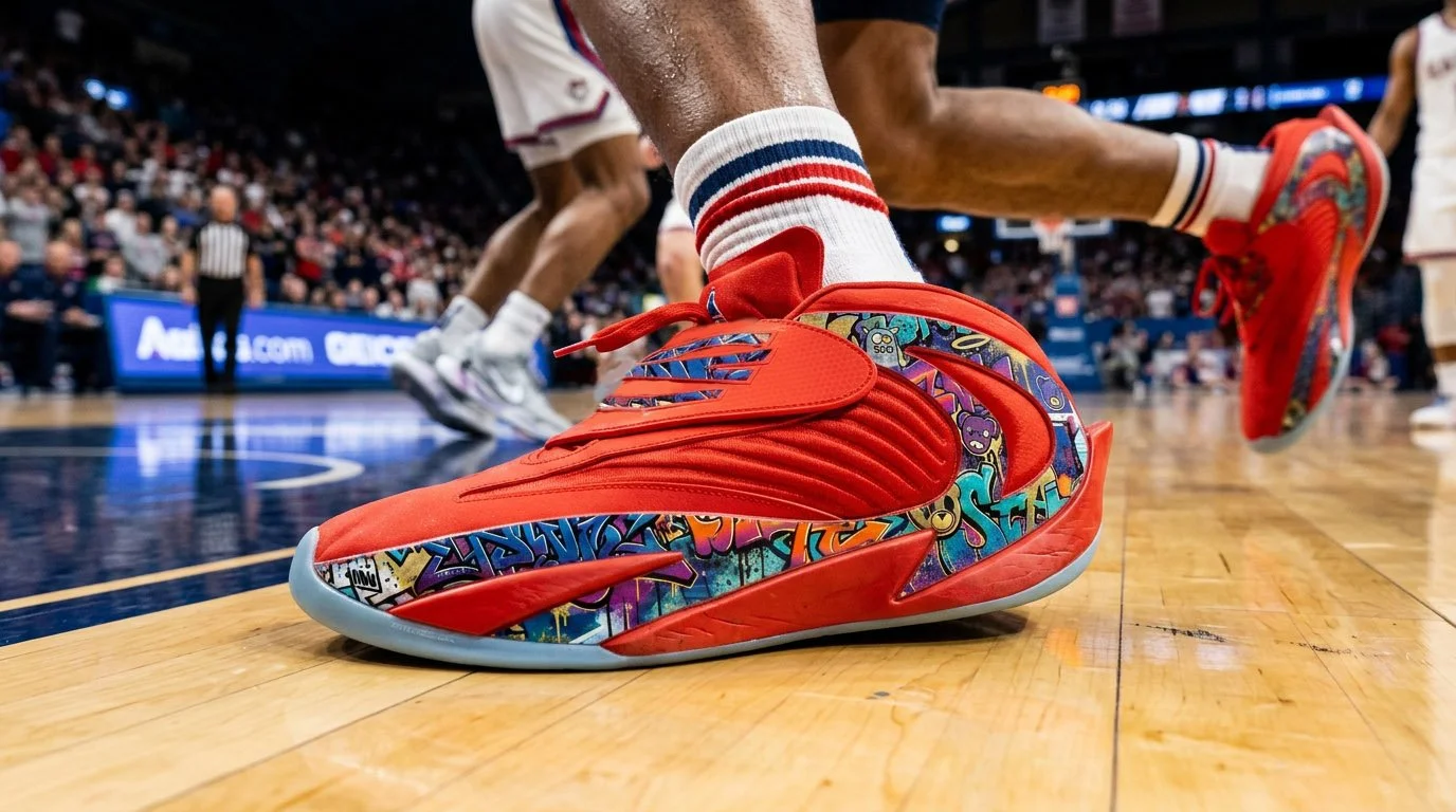
Reebok Iversonics - Red and blue
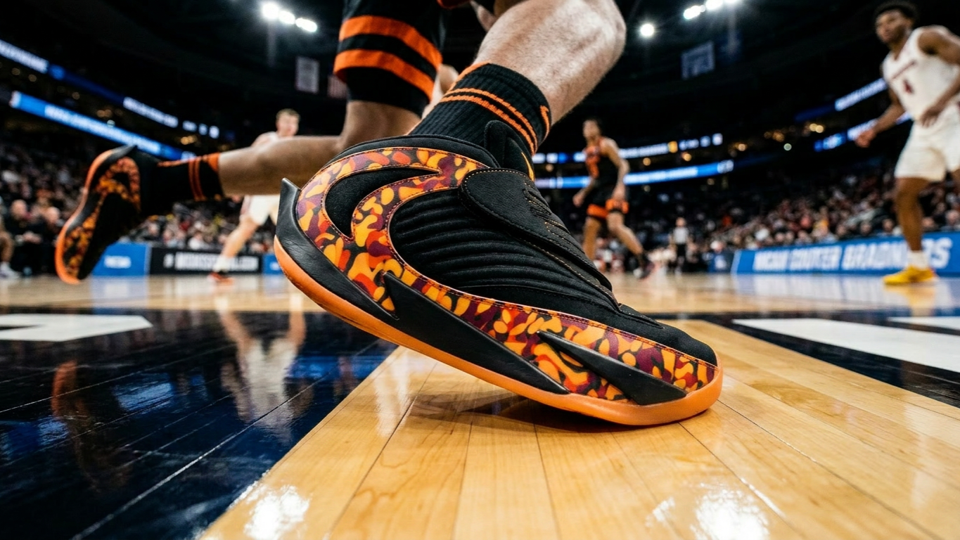
Reebok Iversonics - Black and orange
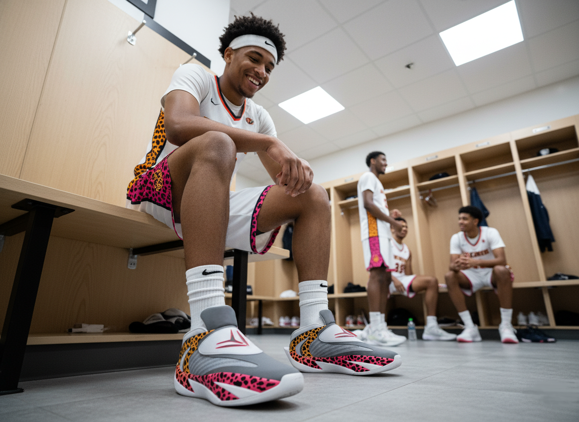
Reebok Iversonics - White, grey, safari
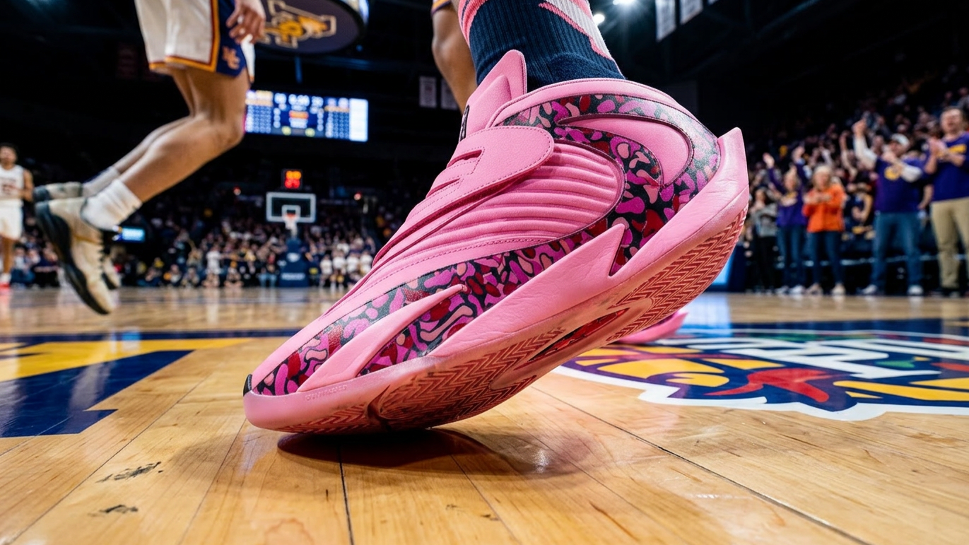
Reebok Iversonics - Pink and violet
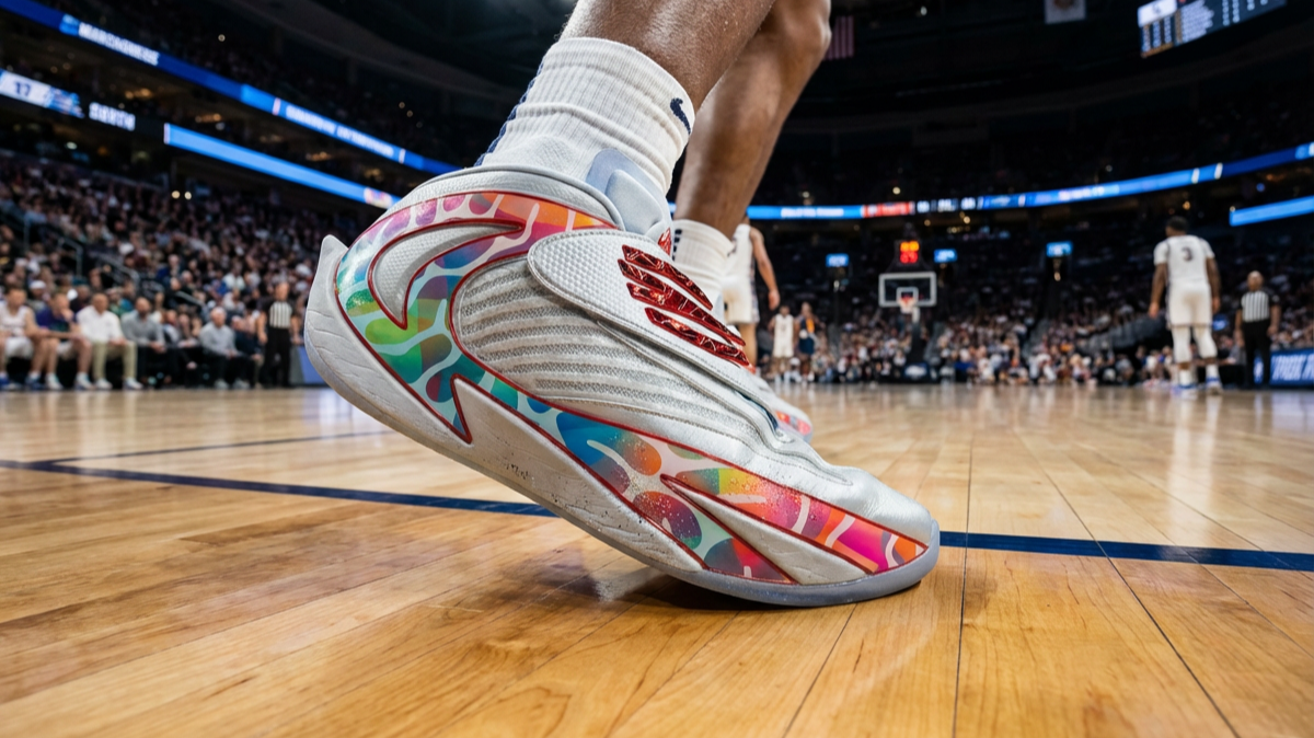
Reebok Iversonics - Silver raimbow
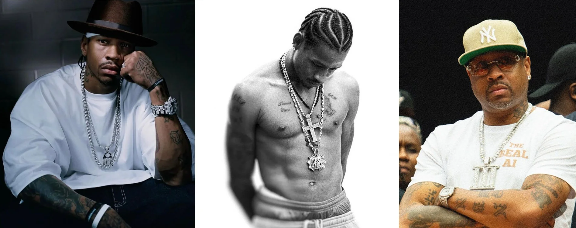
Jewelry has always been one of Allen Iverson’s passion
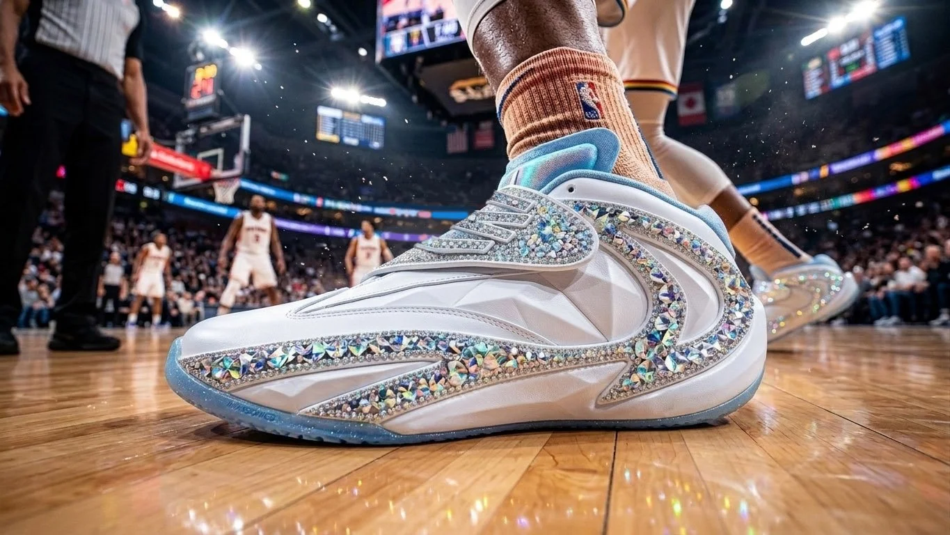
Reebok Iversonics - White and diamonds
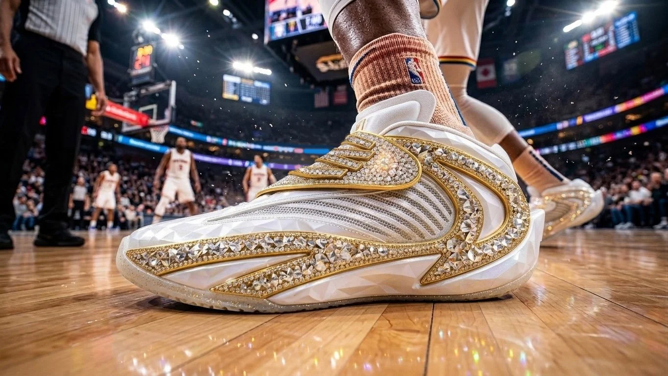
Reebok Iversonics - White and gold
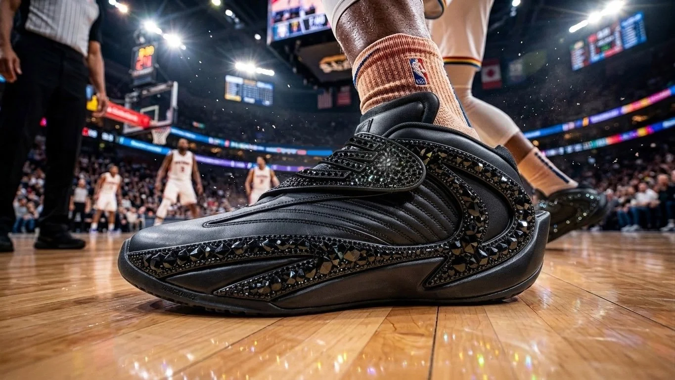
Reebok Iversonics - Black Ice
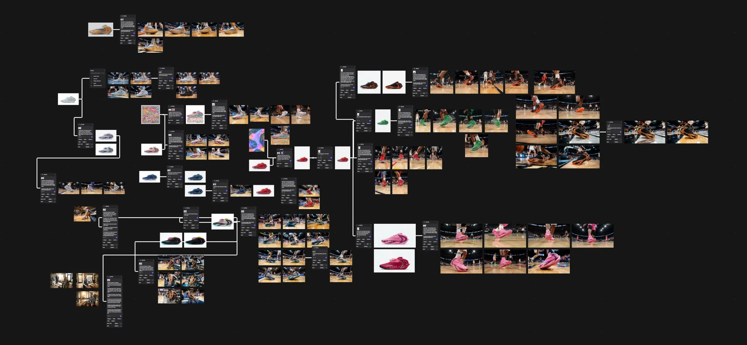
Reebok Iversonics - quick look at AI coulorways generation process
This Reebok Iversonics series got to the end, but I’m very happy about the way it helped me to explore a shoe design creation process in a different than usual way, also allowing me to implement new techniques in my bag of tricks.
I hope you could also appreciate it, feel free to share your comments and feedback in the section below.